Studio Feixen: A Swiss designer’s take on movement
The pillars of Swiss graphic design are order and precision. Felix Pfäffli, founder of Swiss-based design company Studio Feixen, explains how this tradition can be honored and developed with casual brush strokes.
Words by Robert Birnbaum. Photography by Simon Almers.
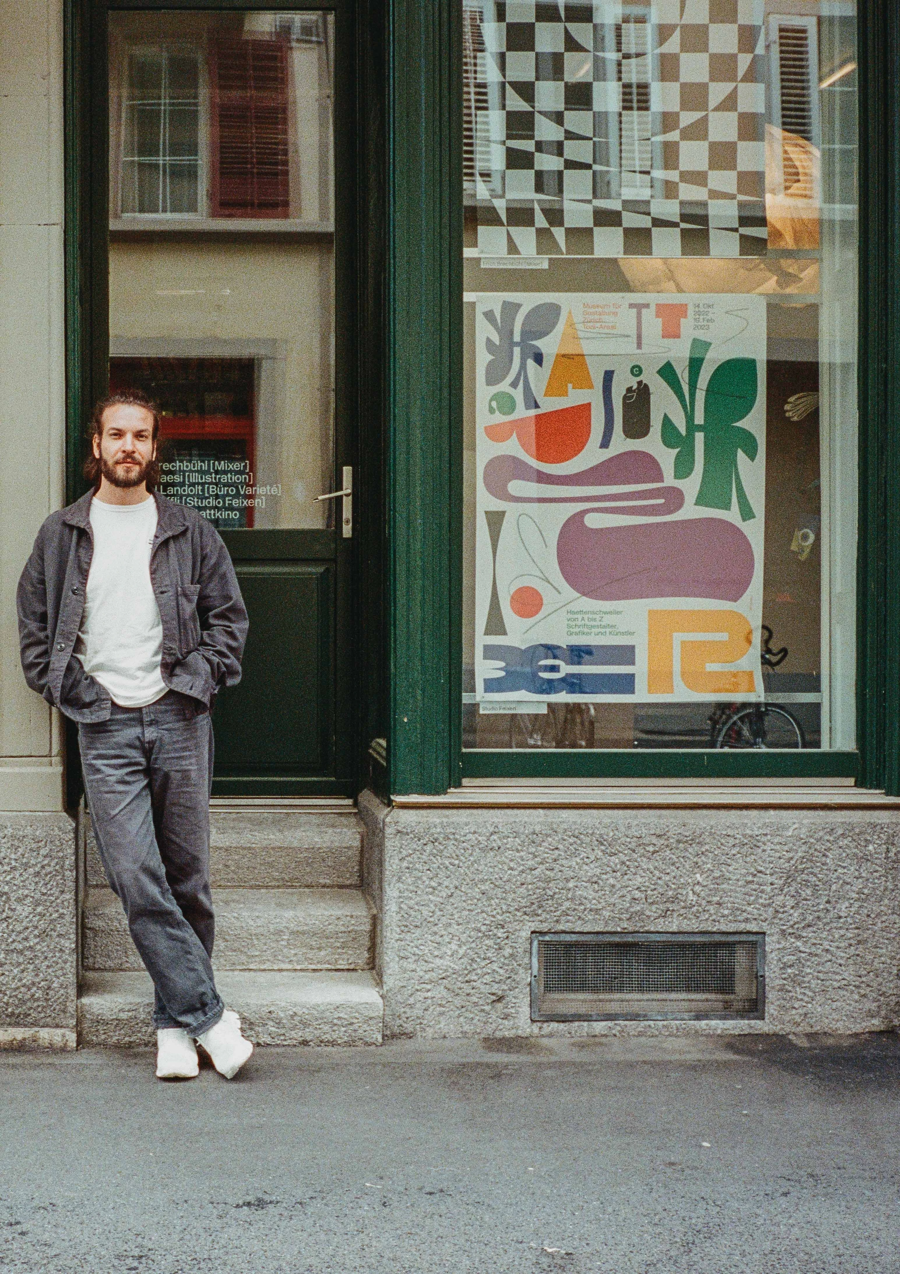
On arriving in Lucerne, Switzerland, we pull into an inconspicuous alley. Before even knowing we’ve reached our destination, we’re being welcomed by Felix Pfäffli – founder of Studio Feixen. First, the friendly designer helps us reverse into the studio’s driveway, then he guides us through the atelier and hands us espresso from a small, but powerful coffee maker. This is Swiss hospitality.
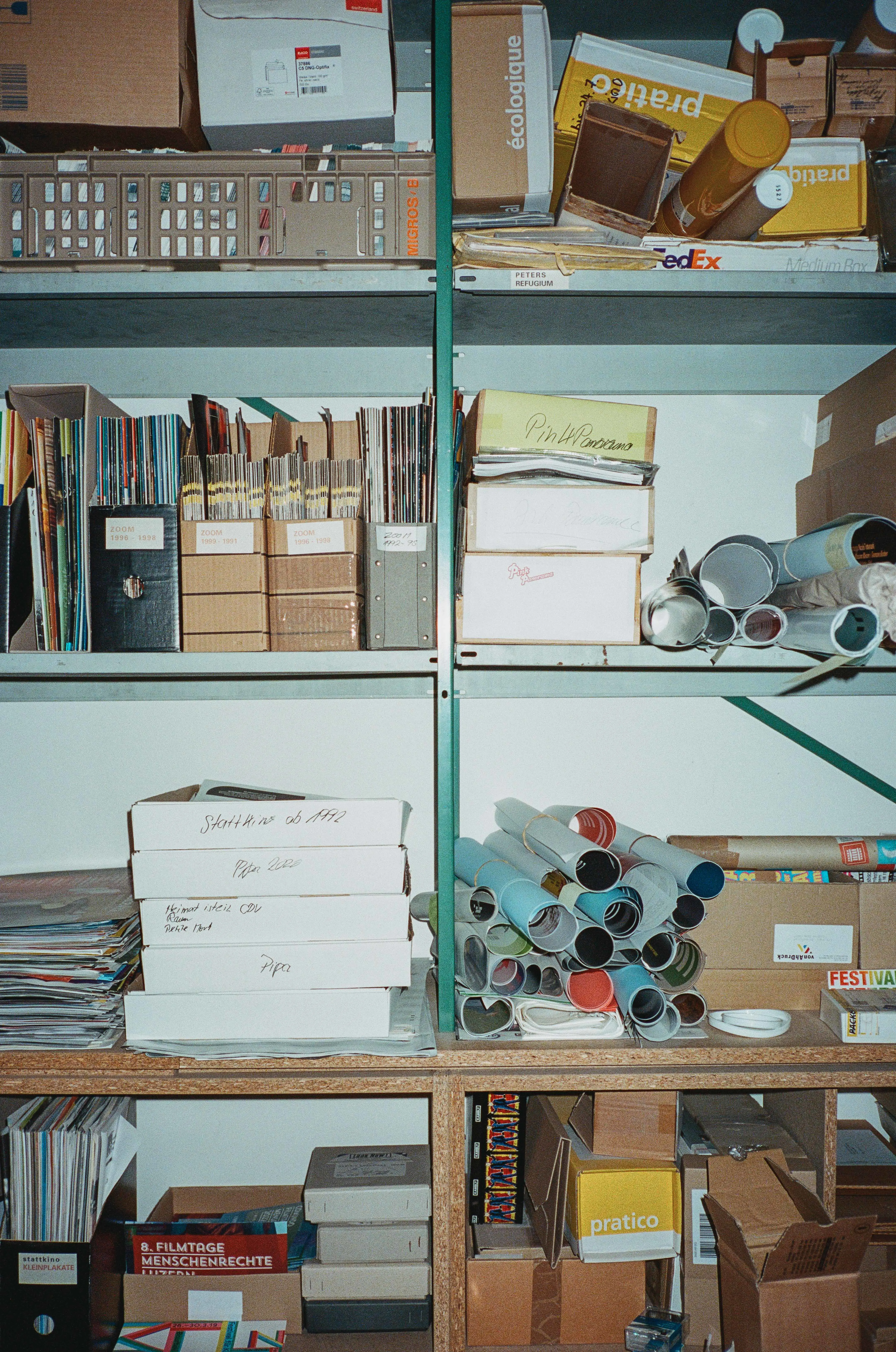
The compact studio serves more than one purpose. It hosts an affectionately arranged workspace for a couple of designers. At the same time, it serves as a showroom, decorated with the results of successful projects. On our tour over the satisfyingly creaking floorboards, we stumble across the most diverse set of designs, gadgets and materials. Among them: bottles, posters, pamphlets, books, shirts, chairs and even a football – all designed by the team at Studio Feixen. Despite being thoroughly renovated, the historic building’s high ceilings and walls with massive wooden pillars still exude a centuries-old charm. Filling out the background is Felix's own playlist, C.M.Y.K. with a constant flow of bangers.
The reason for our visit: The cozy space that is Studio Feixen is the birthplace of the first print graphics specially designed for On apparel. A certain local flair in these graphics is no accident, as On’s Head of Design Thilo Brunner explains: “On is centered around Swiss design and technology. Focusing on Swiss graphic design – also called Swiss Style – for our first prints was an obvious choice.”

But what is Swiss Style?
Being a graphic designer trained in Switzerland, Felix lives and breathes the Swiss Style. “I believe the Swiss Style excels, especially through order. Swiss design is extremely neat, extremely precise with a great attention to detail. At the same time, it attempts to be accessible and understandable across borders.”
And yet, he’s consciously searching for something he was missing during his training: “I was trained to work quite precisely, quite detailed. It’s this coldness of Swiss graphic design that I’ve always tried to overcome.” Essentially, Felix does the opposite. “I feel like my work is much more joyful, has much more energy than the typical Swiss graphic design.”
His courage to expand the Swiss Style in his work has gained him popularity in the international design scene. And before too long, Thilo Brunner started noticing Felix: “His work is characterized by immense precision, while remaining playful. It’s just very, very much on point,” Thilo explains. “You can try to explain his work rationally. But then you keep realizing that his work just feels right.”
On’s Graphic Studio-T is the first-ever On piece to feature a print design. The logical choice to design the prints: Felix and Studio Feixen. “Design at On always follows a very Swiss, minimalist philosophy,” Thilo explains, “Very, very functional with a clear vision. Felix and his work are simply a great match.”

The Feixen-Focus: Nothing in particular
“Whether it’s graphic design, interior design, fashion design, typography or animation – as long as it challenges us, we’re interested,” is how Felix explains the direction of Studio Feixen. “My favorite projects are those where I can start with a clean canvas. You have to be courageous and try something new. That can be scary, but mainly interesting. This is what I need.”
This was one of the reasons why the collaboration with On excited him so much. “I had free rein on how I wanted to express movement. I started with about 30 drafts and kept working on them until we decided on the final three designs.”
At first look, the graphics appear like casual brush strokes. But that’s exactly what Felix wants to achieve with his design philosophy: “I don’t want people to feel how much time I invested into a design. It should simply feel right. I want to reach a point where I can’t see anything I would change.”
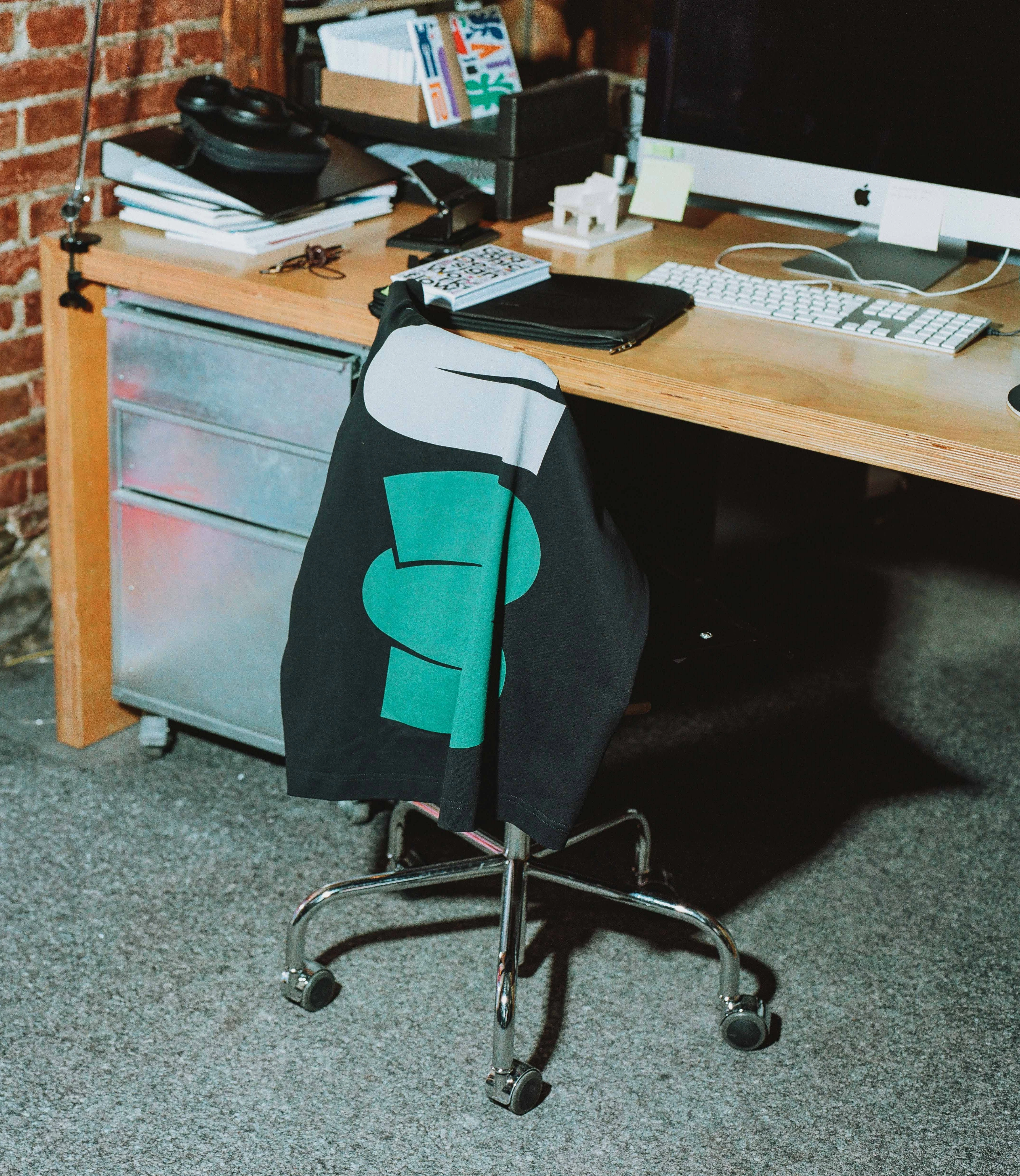
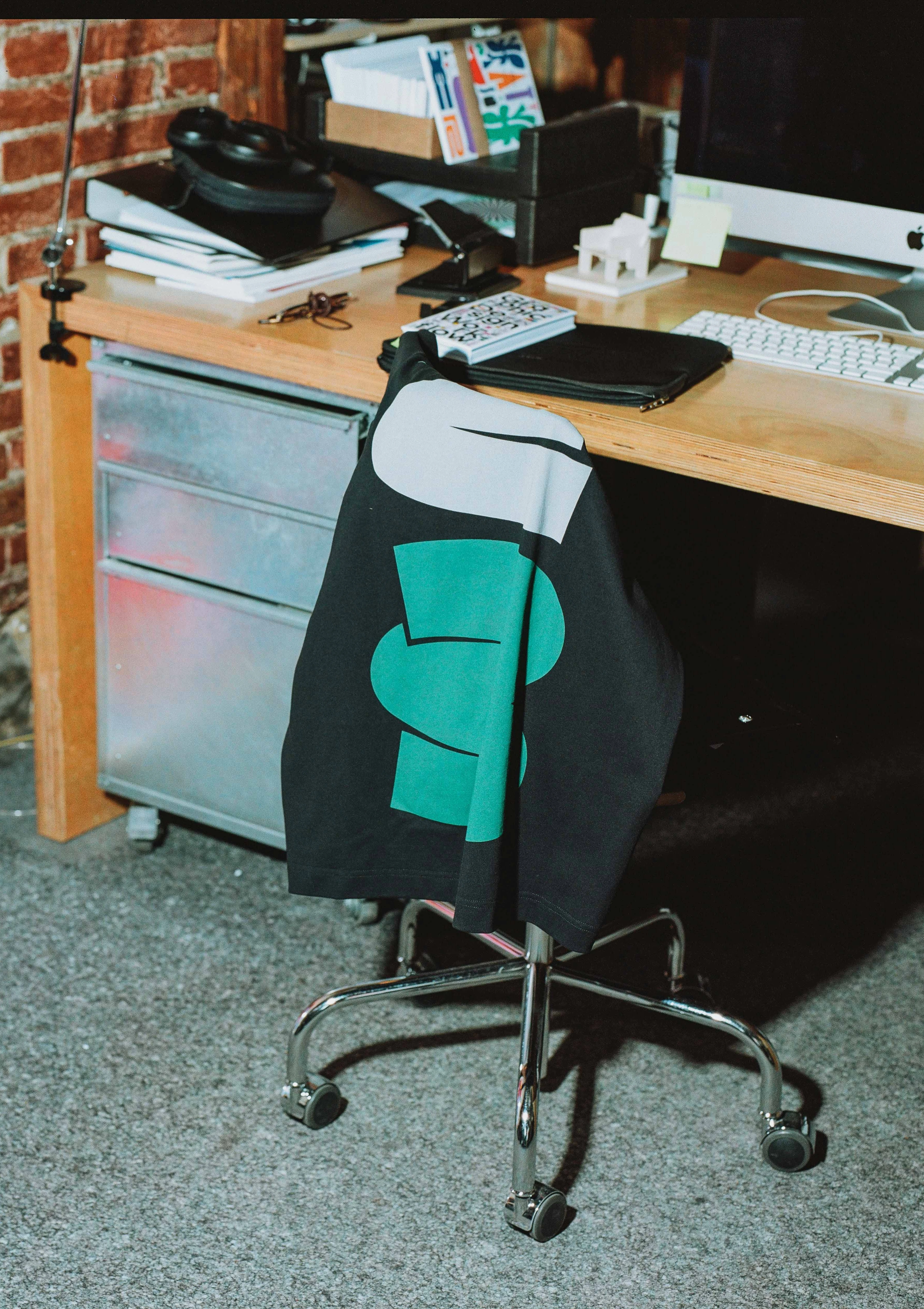
The result: One design each for running in the city, on the trail and on the track – on black and white Studio-Ts to represent day and night.
Brush in Motion
“I wanted to find out how much one brush stroke can achieve”, Felix elaborates, when asked about his approach. “A brush stroke tells a story, it describes a movement.”
A typography and calligraphy fan, Felix wanted to create a typeface without letters. But why? “You could have also just written the word ‘city’ but that wasn’t our intention. We tried to find a language that (like the Swiss Style) is internationally understood. In doing so, we ended up with a typeface without content. You can’t read it, but you can feel it. It’s a font that communicates movement.”
“The symbols all have meaning to me. They describe a movement or a place. But they’re abstract enough that you see more in them than just that. And that’s exactly what I like about them. You just decide for yourself what the symbols mean. Or you just wear the T-shirts because you think they look good.”
This design hails from more than a sophisticated design process. For Felix, his inner conviction plays a similarly important role: “When I design something that’s meant to be worn, I’d ask myself if I would wear it. And I’m no fan of shirts with a concrete message written on them. I much prefer shapes.”