
We cannot guarantee deliveries to the area. We hope to be back soon.
Dan Thawley talks to Dongjoon Lim, the Creative Director of Post Archive Faction (PAF) about the collaboration with On and creating a visionary collection with “a new design language.”
Words by Dan Thawley. Photography by Alex Cascallana and Simon Almers.
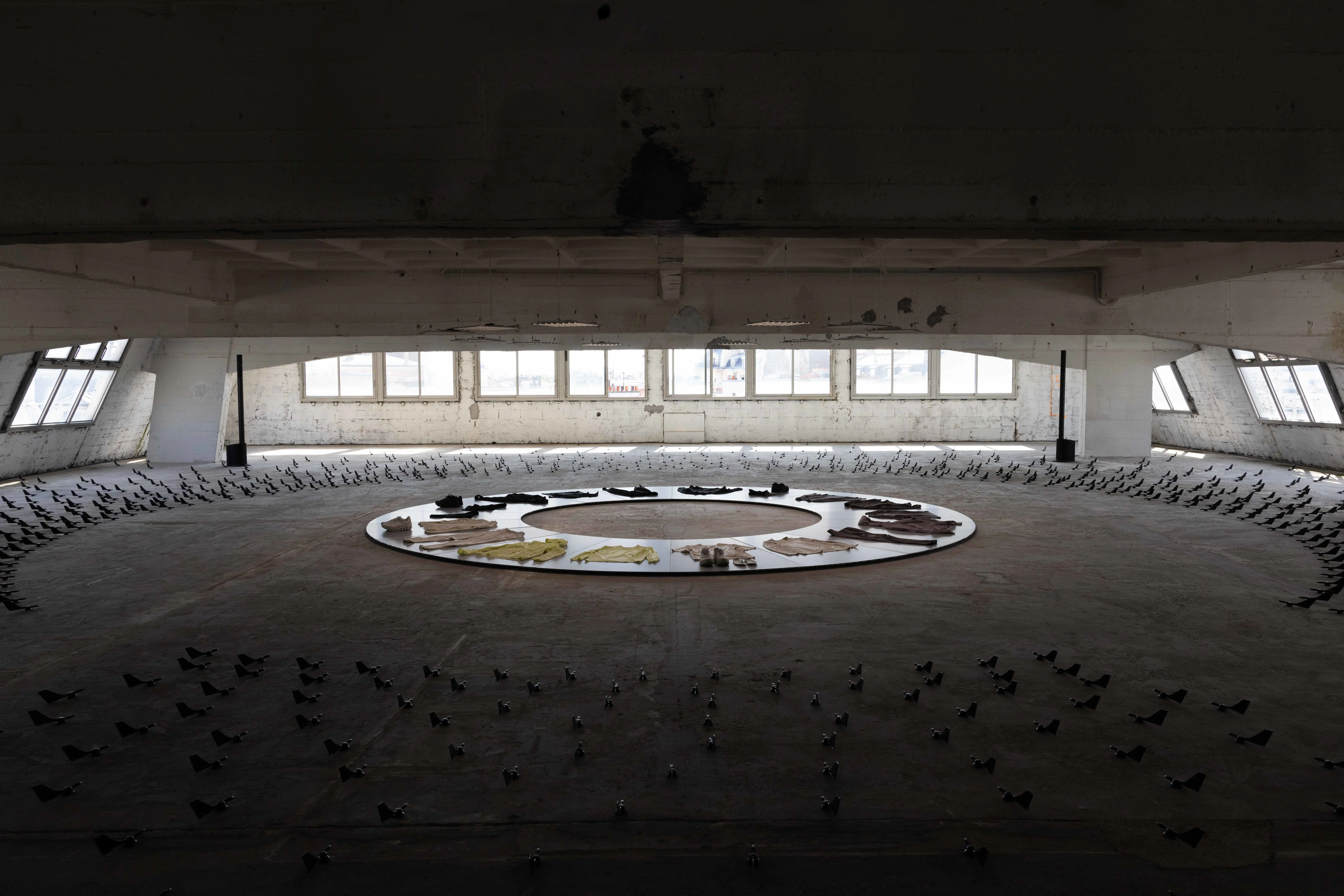
June 2023: The Paris showroom for On’s partnership with the Seoul-based designer brand Post Archive Faction (PAF).
A fusion of high-performance visual language and boundary-pushing concepts that define two entities – one Swiss, one South Korean. Visitors climb multiple stories up the spiral ramp of an empty, industrial parking block. They face interactive islands where LED screens translate one’s body movement into streaking silhouettes, shown in constant movement through meta-vision camera concentric ‘crop circles’ of wind vanes becoming symbols for the project’s title, Current Form 1.0.
PAF is the brainchild of Dongjoon Lim – a millennial autodidact in the fashion world whose studies in industrial design inform his avant-garde approach to garment-making. Lim established PAF with Sookyo Jeong in 2018. They challenge traditional pattern-cutting methods and apply radical techniques to technical fabrics, resulting in organic shapes and exploded silhouettes that combine unexpected textures and shades.
They work in series (rather than traditional fashion seasons), with seven main collections to date that continue to hone their future-facing aesthetic. PAF clothing harbors a uniqueness – one that attracts a cult following in the world of utilitarian ‘gorpcore’ fashion, and those simply searching for innovative forms in streetwear. Whether it’s bombé puffer jackets with curving zippers and pillow-like stuffing, amorphous pockets sprouting from asymmetric matte nylon trousers, or optic white shirts shot through with laser cut constellations, PAF’s fusion of archetypes and freeform design is a unique proposition.
PAF’s methodology has imbued the On × POST ARCHIVE FACTION (PAF) Current Form 1.0 collection with literal and figurative layers. Two-tone designs pair shades of grayscale and moon-dust yellow, black-on-black ensembles with complex 3D patterns, and contoured silhouettes that serve both aesthetics and utility. “The fabrics are very lightweight and very performance-oriented,” says Lim. “Also, they have beautiful ventilation. It is a high-performance product, like a sports car. Beautifully designed equipment for performance.”
Dan Thawley: Tell me about the origins of Post Archive Faction (PAF) and how you began? Where does the name come from?
Dongjoon Lim: The name is simple. Post Archive means ‘after archive’ and Faction means ‘group of people’, especially in a political sense. I think nowadays we can really access all kinds of archives from the internet, even AI – it's crazy. Maybe soon we can access archives even more easily and also create AI-generated designs. But now, we're focused on researching archives and building a new generation of archives. Archive means timeless, for me.
DT: How does that inform your design approach?
DL: We’re always focused on uniforms. When I think about my teenage years, half of my life was spent in uniform. I was in school uniform from middle school and high school and, after that, in military service. Most Korean guys serve in the military for about two years. Afterward, I just wanted to build my own kind of uniform. The "uni" means “one” in Latin. And then what we are doing is transforming a uniform into a multiform: right, center, and left. We can think about it like a political spectrum. Right is a more conservative point of view. Left is a radical and experimental point of view. And the center is between them. In this way, we have transitioned from uniform to multiform. Sometimes we start from the right, with a very conservative item or very conservative way of design. But we always try to create some interaction or transformation between items or categories. I studied industrial design; I didn't study fashion. So, I think I needed to create my own kind of framework to build a collection.
DT: How did you first connect with the team at On?
DL: Have you ever heard about the Instagram account @organiclab.zip? It is a research-driven curated account, a new form of encyclopedia of this time. I’ve been following it over five years, and become a good friend with the anonymous pioneer behind the account. Then one day, in Paris, around the time of Virgil’s last Louis Vuitton show in 2021, my friend introduced me to the On team – that was the beginning. We had dinner and discussed doing something together. It felt very natural and organic. Later, we went on an ‘immersion trip’ in Switzerland to see the mountains and go hiking with the team before we began designing.
DT: How did you apply the concept of PAF to the Current Form 1.0 collection with On
DL: It’s about presenting a radical version of On. But ‘radical’ is relative. We're trying to find a balance between two different spectrums, which at the same time, builds another color and another shape that fuses our different universes.
When we first looked at On’s design language, we found it systematic – like the Helvetica font. Very minimal, efficient, functional. It is like a straight line. What we did was to create a new curve from it. This is the key meaning of faction: there is some kind of original stream, and a faction is divided from the original stream to create a new stream.
DT: Tell us about the way you approached the Cloudmonster 2?
DL: We tried to find a new design language. What we achieved is quite simple compared with other recent collaborations in the industry which are often very exaggerated, very colorful, dramatic. We wanted to create a new direction for running shoes infused with new aesthetics of contemporary fashion. But at the same time, as designers, we just wanted to simply make something beautiful that I would wear in my daily life. For the front of the shoe, we were inspired by the curve of the Limmat, the river in Zurich. I floated down the Limmat when I visited On and I really loved it. I’d never experienced that in my life. The water is so clean. It was so amazing. So, we extracted the shape and the energy of the Limmat and deployed it on the shoes and garments to create a very organic, beautiful product based on the Cloudmonster 2. It’s about the idea of the city and nature coexisting in a perfect way.
DT: What do you think of the idea of ‘gorpcore’ [an outdoor, trail-inspired, functional fashion trend]? Is that something that inspires you, or do you think you're a part of it in some way by default, as the PAF functional aesthetic just makes sense in that world?
DL: I love to make something functional. The natural environment of Seoul, which we've been living in for our entire lives, has distinctive seasons: fall, winter, spring, and summer. Of course, it's changing because of climate change. But we have intense winters. We have intense summers. We have beautiful spring and fall. So, depending on the seasons, we need to wear something that looks good but is practical at the same time.
DT: Do you see any other connections in the way that Swiss and South Korean people think about design or lifestyle?
DL: Both countries are small, with mountains and rivers dividing their cities. People have high standards in design, aesthetics and performance. Performance clothing and the outdoors – people really enjoy it. Our parents' generation or grandparents' generation always go to the mountains every weekend. They have a huge community there. It's so fun, their local style. Like grandma and grandpa gorpcore [laughs].
DT: Tell us about the unique details in the collection: the perforations and the clusters of dots on the garments. It looks like the pieces are breathing.
DL: That's right. They are very precisely designed, with intention. Aesthetically, we tried to embrace organic elements when we design the collection which is something completely artificial. And there is some irony there. The Limmat [the river running through central Zurich], for example, is not 100 percent natural. It's partially artificial because it’s manipulated to exist in harmony with the city. So we create that duality within our product as well. We want to create things that remind us of some kind of organic shape. I really love to play with that kind of design element as an interaction. It’s like an interaction in our minds and in our hands. It could look like some particles, or it could look like splattered mud. It could look like droplets of water, something wet. I always look to open those kinds of possibilities because that stimulates our imagination. That design-thinking is really enjoyable. And, in terms of function, they’re reflective. It helps for safe running at night. And at the same time, imagine seeing those dots moving while people run: they create new linear forms of light.